The perception of the brand, and the building of a company persona, is important to many businesses, keen to separate themselves from the competition, attract the best of the Gen Zers۪ and to define their presence and status - regardless of their industry.
The promotion and fostering of corporate identity is certainly influencing office design and fit out, at the moment, with more and more companies favouring designs which incorporate and reflect the personality of their brands in order to tell their stories and engage with the desired audience.
Considering the culture
An office refit or refurbishment is the ideal opportunity to build a base for a company۪s culture, while helping to create and build core elements of that culture, influencing it and representing it; shouting to announce what the brand is all about.
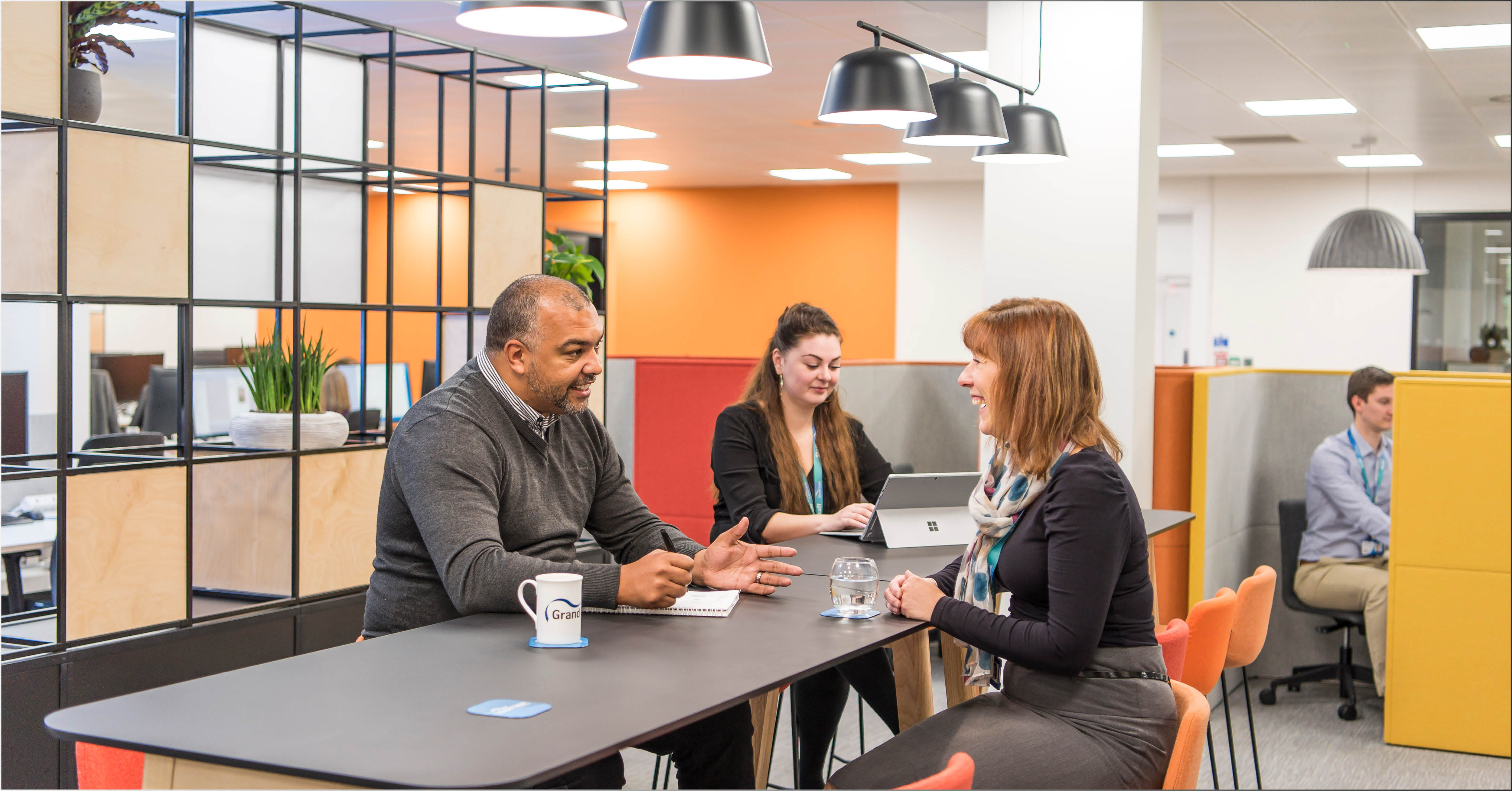
Mindful design can help to introduce and drive specific cultural overtones, as well as facilitating the delivery of messages about the brand.
Corporate culture will be enhanced by the most conducive environment; the office is the hub which enmeshes a business۪s characteristics and gives scope for expression.
Setting the right tone
As the physical embodiment of the business, the office can advertise just how great a company is.
It can speak to the visitor about corporate ethics, customer service and how you, as a company, see yourself not to mention how you value your staff.
By stepping into a space, we get an immediate reading of how relaxed and friendly it is and we will likely adjust our own behavior in accordance. It۪s an emotive experience because, when we come away from a building, we are left with an impression of how it made us feel.
Core principles
Previous office core design principles upheld the workplace as a regimented and disciplined environment, where workers operated within rigid parameters, adhering to standardized rules and regulation.
That all changed in the last couple of decades, with the introduction of a more flexible approach to working life, the advancement of technology and the influences of more fluid design styles, incorporating a mix of spaces.
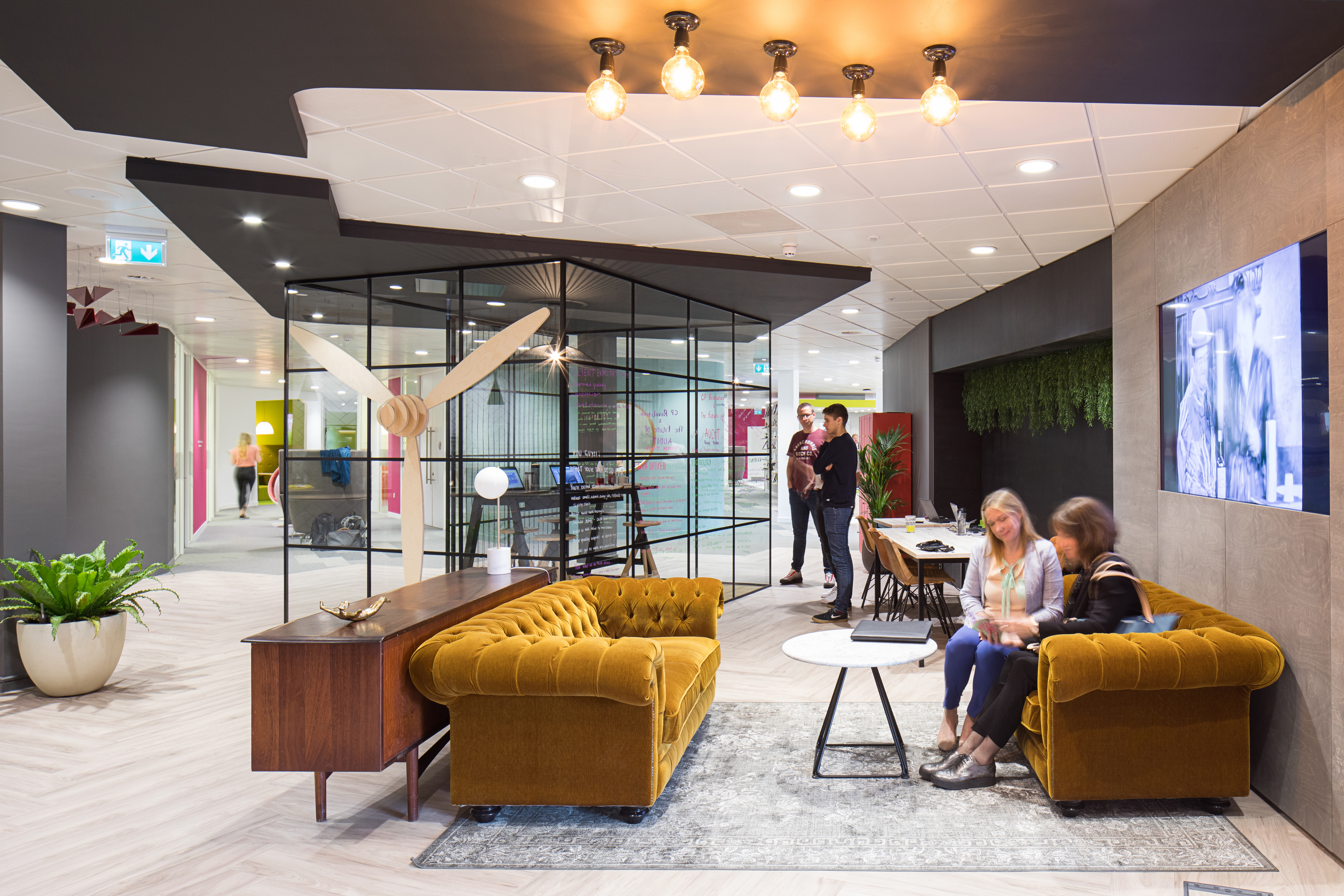
These fluid environments have become the norm now and most companies embrace this style of design in order to demonstrate a more relaxed and tolerant approach, celebrating a varied range of working styles and requirements.
Trending now
Given that, we are seeing more slouchy sofas and artful, homely d̩cor incorporated into office design - particularly in common areas. The furnishings are complemented by easy access to top notch facilities such as coffee machines, healthy vending, elegant bathrooms and state of the art kitchens; plus exercise, relaxation and quiet zones and liberal doses of green.
Creating a chilled out ambience, these places are encouraging users to take time out and relax; they also entice workers to pick spaces that allow them to interact, while providing the best vibe to keep the creative juices flowing.
For all the quiet spaces and discreet booths, there is an equal amount of long shared desks and benches which, again, indicate that a company is keen to offer its workers the opportunity for interaction while also respecting the need for individual space and quiet.
These mixes of spaces provide a basic canvas and reflect a pattern that is evident across a whole mix of corporates and smaller concerns. In the main, the shared DNA of these offices speaks of the corporate desire to address the employees۪ needs; the provision of comfort and the commitment to supporting workers۪ health and wellbeing.
Those are the staples.
What really affects the brand in the workplace is what is done to individualize this canvas and that involves a lot more than placing a corporate logo on a wall
Bringing colour to the mix
Colour is a specific element that be utilized to introduce the personality of a brand.
A business may already have an established colour palette, which is used for all external connectivity, however this can be enhanced and complemented in the work environment.
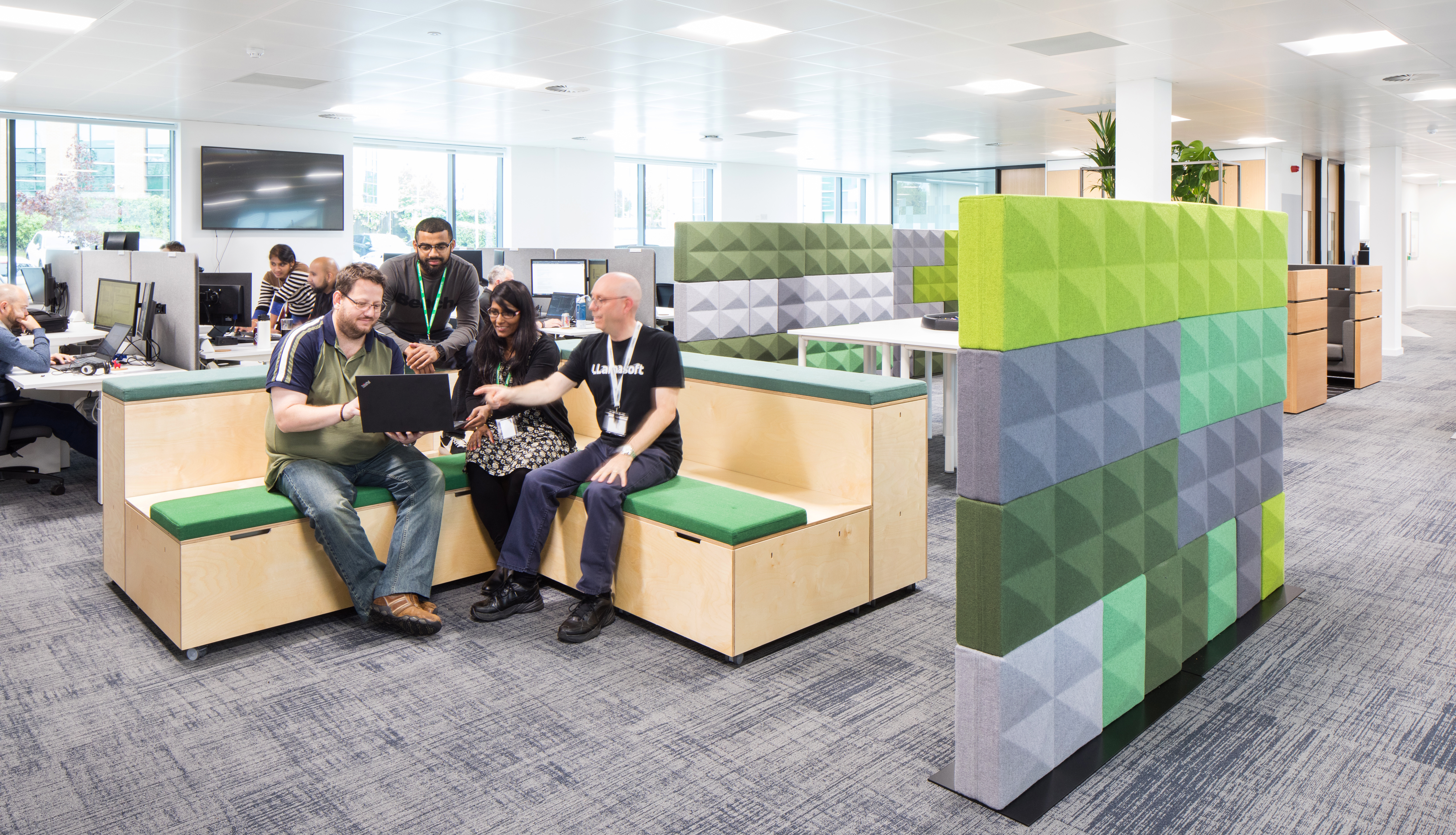
Brand colours may have been picked to reflect personality and attitude based on the feelings those colours traditionally evoke. For example, the colour red has many connotations from power and leadership to passion and strength. These colours can be used in the office to reinforce the presence of the brand and support the efforts to create such perceptions.
Alternatively, the colours in the office can indicate other qualities that may not be otherwise apparent. For instance, the choice of tones and hues may discreetly indicate how youthful an office is or could be used to imply positivity and an open-minded, inclusive approach.
When utilising brand colours, to infuse the office with your specific corporate energy, aim to use them consistently so that there is a theme running across all the different spaces, tying them together.
If you۪re confident of those colours and what they say about the brand then go bold and run with it as it is the most immediate way of linking your space with the image of the brand and determining a confidence in that brand.
The knowledge
The company is its people and, as brand ambassadors, they should be heard.
In order to make space relevant and unique, it۪s always good to find out what the people who work for a company think about the brand what it stands for; key words and phrases that are thought to embody it and what people believe sets it out from other brands in the sector.
Team input makes space individual. Inviting employees to be part of the design and creative process means that they have some ownership and are more likely to be bonded to the space and the company.
 Mindful design can help to introduce and drive specific cultural overtones, as well as facilitating the delivery of messages about the brand.
Corporate culture will be enhanced by the most conducive environment; the office is the hub which enmeshes a business۪s characteristics and gives scope for expression.
 These fluid environments have become the norm now and most companies embrace this style of design in order to demonstrate a more relaxed and tolerant approach, celebrating a varied range of working styles and requirements.
 Brand colours may have been picked to reflect personality and attitude based on the feelings those colours traditionally evoke. For example, the colour red has many connotations from power and leadership to passion and strength. These colours can be used in the office to reinforce the presence of the brand and support the efforts to create such perceptions.
Alternatively, the colours in the office can indicate other qualities that may not be otherwise apparent. For instance, the choice of tones and hues may discreetly indicate how youthful an office is or could be used to imply positivity and an open-minded, inclusive approach.
When utilising brand colours, to infuse the office with your specific corporate energy, aim to use them consistently so that there is a theme running across all the different spaces, tying them together.
If you۪re confident of those colours and what they say about the brand then go bold and run with it as it is the most immediate way of linking your space with the image of the brand and determining a confidence in that brand.